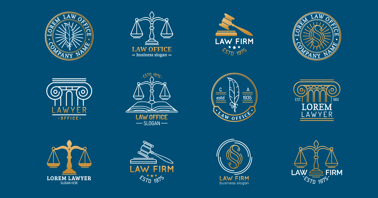
A unique, memorable law firm logo is almost a must-have requirement for any successful personal injury law firm. The most outstanding law firm logo design is necessary if you are starting a new law practice and need to establish your brand identity, but it can also be useful for firm’s who have been in business many years but might be in need of a “branding refresh.”
The best law firm logos convey the business’s personality, values, and goals. As a result, your personal injury practice must provide your clients and partners with accurate information. It must be relevant to your legal work.
- A logo is your law firm’s face and has an immediate effect.
- Your law firm’s logo is the visual differentiator.
Below, we have described the five steps you should follow to create the best logos for law firms. So, keep reading.
Contents
Choose the best colors for your law firm logo design
The ideal law firm’s logo color should convey the right brand message to the intended market. So, when choosing your logo’s colors, ensure they have a neutral tone for a polished look. Additionally, pick hues that will help you stand out from the crowd. You can choose complementary color schemes with the help of online color-selecting tools. Once more, your color schemes serve several functions. They could aid in increasing traffic.
The hue of your law firm’s logo elicits particular feelings in the minds of your audience. People can infer what you do and who you are from your logo’s color scheme even before they examine it or learn your law firm’s name. The colors you choose for your brand are crucial. Colors used in logos can have a significant impact on your brand.
For instance, red is frequently connected to strength, while blue is supposed to represent tranquility. In addition to money, green can signify new beginnings, and purple is commonly used to denote regal status. Keep in mind your law firm’s logo color also influences your clients’ perception of your authority.
- Different colors have powerful psychological associations with people, so put some thought into your logo color choice.
- Unique law firm logos built with unique logo colors also yield specific intended outcomes, like better visibility or monetization.
Select the best font for your law firm logo
The best logos for law firms have the correct font. The font in any law firm logo represents the firm’s mission. Hence, your fonts must be easily readable. And the font you choose for your law firm’s logo must be clean and exciting.
Avoid cursive and script fonts. They limit the graspability of your logo’s messaging. Instead, choose modern fonts that combine modernity with innovativeness. Classical fonts are traditional and dependable, adding value to your law firm’s logo.
The Google Fonts is an excellent start. The tool allows you to choose suitable law firm logo fonts for your preferences.
- Audiences will most likely link your brand with the font used in your logo.
- Distinct fonts convey different qualities, and each has a unique personality.
Craft a memorable law firm logo
Are you a new law firm that’s seeking a remarkable law firm logo to create a lasting impression on target clients? Research to find out what your competitors’ logos look like.
Pick some exciting bits from your competitors’ logos and think about how your law firm’s logo can beat them. Critically analyze these logos and identify what you like.
What do your competitors’ logos not have? How will your logo fill in the existing gaps? Your law firm’s logo should complement your style or perspective on life? It should attract clients by communicating what your law firm does best.
- Your target audience will only remember your logo if it stands out from your competitors’ logos.
- A memorable law firm logo communicates what the law firm does best.
Choose between a modern or traditional law firm logo design
Do you want to appear traditional or modern? Law firm logos have either the standard design or the contemporary design. A modern law firm logo design is good if you want to appear adoptive and sleek.
On the other hand, a traditional law firm logo design portrays your firm as long-established and storied. It may be the best to choose the conservative law firm logo design and add some modern touches but then again, maybe you could stand out with something more unique.
- New law firms benefit more from traditional law firm logo designs.
- Modern law firm logo designs are more distinctive.
Keep your attorney logo design simple
The best logos for law firms are simple. Simplicity helps your target clients relate to your business effortlessly. People can quickly memorize a simple logo.
Conversely, a complex logo design is difficult to memorize and recall. And it gives your clients a different impression of your law firm.
Likewise, simple law firm logos easily fit business cards and serve as icons in browsers. They are easy to store
- Simple law firm logos communicate professionalism and straightforwardness.
- Simple logos are accommodative and clear.
A lot goes into you having a professional, valuable law firm logo. Fortunately, the efforts are worth putting in.

